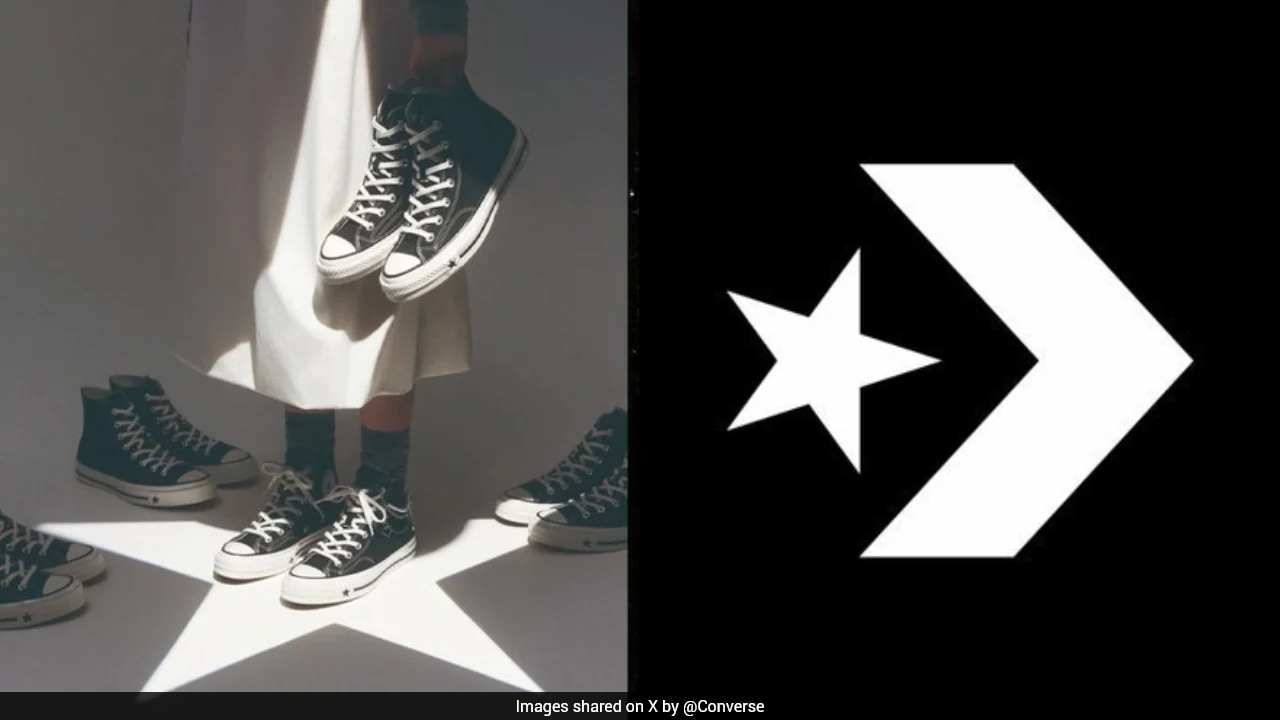
Converse pulled a prominent marketing campaign after public backlash erupted over graphic elements that critics argued resembled Ku Klux Klan hoods, exposing deep vulnerabilities in how massive footwear corporations screen creative output. When an iconic sneaker brand with over a century of cultural capital signs off on imagery carrying even a faint resemblance to domestic terrorist symbolism, the failure goes far beyond an isolated oversight. It points directly to a systemic breakdown inside modern creative review pipelines.
Mistakes happen. This was not a simple mistake. It was a failure of institutional imagination. In related developments, we also covered: The Empty Foundry And The Price Of Standing Still.
The Anatomy of Corporate Creative Blindness
Major brands operate within insulated ecosystems. Creative agencies pitch concepts. Internal marketing committees review mockups. Legal departments check trademark clearances. Yet, despite layers of gatekeepers, visual signals that trigger immediate alarm bells among the public routinely slip through every checkpoint.
How does this happen? Groupthink reigns supreme in corporate conference rooms. When a team spends months staring at the same mood boards, color palettes, and vector graphics, their brains stop processing the raw visual information. Familiarity breeds blindness. The lines, folds, and overlapping triangular shapes cease to be perceived as distinct cultural artifacts and instead become sterile design assets approved for mass consumption. The Economist has also covered this fascinating issue in great detail.
Furthermore, creative personnel often lack diverse lived experiences. A boardroom filled with individuals from homogeneous backgrounds will rarely spot cultural landmines hidden in plain sight. What looks like an abstract geometric shadow to an exhausted executive working midnight revisions looks entirely different to consumers carrying generational awareness of hate symbols.
Why Bureaucratic Insulation Protects Bad Visuals
Corporate hierarchy actively discourages dissenting voices. Junior employees who spot a troubling visual parallel during a routine quality check frequently second-guess themselves. They weigh the social cost of raising an objection against the corporate penalty of slowing down a multi-million-dollar product launch.
Bureaucracy rewards momentum. Pausing a campaign requires justification, senior sign-offs, and uncomfortable conversations about missed deadlines. Consequently, cultural risk assessment gets treated as a compliance checklist rather than an active investigative process. Teams rely on algorithmic tools and standard asset libraries while neglecting the messy, human work of cultural contextualization.
When Converse pulled the advertisement, executives reacted to the external storm rather than internal vigilance. The firestorm erupted on social platforms within hours of the campaign rolling out. Users zoomed in on specific angles, drew comparative overlays against historical imagery, and disseminated the critique faster than any corporate communications department could draft a holding statement.
Speed defines modern outrage. Brands no longer have weeks to monitor consumer reception. They have minutes.
The Semiotic Audit Gap in Major Footwear Marketing
Semiotic analysis examines how signs and symbols communicate meaning within a culture. Most footwear brands treat semiotics as an afterthought, focusing instead on color theory, product durability, and lifestyle alignment. They invest heavily in tracking sneakerhead resale markets while underfunding cultural anthropology research within their creative departments.
A thorough semiotic audit would have flagged the contested visual elements immediately. Triangles pointing downward, stark white conical silhouettes against dark backgrounds, and stark contrast framing evoke specific historical terrors in Western societies. Even if the design team started with an innocent concept—such as folded canvas, origami geometry, or abstract lighting effects—the final execution carried heavy semiotic baggage.
Neglecting semiotic safety checks is professional negligence in modern consumer goods marketing. Consumers do not evaluate advertisements in a vacuum. They interpret corporate visuals through the lens of current political polarization, historical trauma, and heightened vigilance against coded bigotry.
Rebuilding the Approval Chain Before the Next Flashpoint
Fixing this recurring corporate crisis requires structural overhaul rather than superficial apologies. Brands must decentralize creative approval and introduce red-team protocols specifically designed to find offensive, triggering, or controversial interpretations before anything goes public.
Red-teaming involves assigning a dedicated group of independent internal critics whose sole job is to destroy the campaign concept. These individuals operate outside the creative loop. They examine the work with maximum cynicism, searching for hidden meanings, accidental homages, and visual double entendres. If a concept passes through a hostile internal audit, it earns the right to face the public.
Footwear giants also need to diversify their creative partnerships. Relying solely on legacy advertising agencies creates echo chambers. Bringing in external cultural consultants with expertise in semiotics, sociology, and historical iconography provides an essential external filter.
The Real Cost of Aesthetic Negligence
Financial losses from pulled campaigns extend far beyond production budgets. Media spend vanishes. Retooling distribution channels incurs secondary costs. However, the true damage hits brand equity. Consumer trust is fragile. When a sneaker brand becomes the center of a hate-imagery controversy, it alienates core demographics and hands market share directly to agile competitors.
Converse survived this specific firestorm through rapid retraction and damage control, but the underlying vulnerability remains unaddressed across the wider apparel industry. Until corporations treat visual semiotics with the same rigor they apply to financial accounting, preventable design scandals will continue to erupt.
The warning signs are always visible to those willing to look. Ignoring them is a choice.